
A Modest Proposal
After publication it became evident that there was the possibility of taking the typeface further by adapting and extending the font to include the rest of Joyce's Wake sigla and any other elements deemed useful for Wake studies.
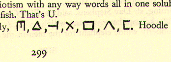
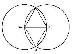
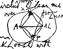
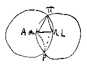
Finnegans Wake Faber 1939, p299
Althought it could have been a simple matter to progress by adding to the original typeface the missing sigla - in the style developed with Danis Rose - a straw poll of Wake scholars along with further investigation made it clear that there are a number of issues that require to be resolved.
Style - Two distinct camps arose - the tall & skinny (Rose) and the short & stocky (McHugh). This difference is more complex than just the thickness of the letters and involves the stem proportions. A hybrid of the two might fail to please anybody. Theoretically there is room for 256 characters in a typeface, (in practice only about 128 are cross-platform consistent), and this might enable the creation of a dual set of characters for both style camps.
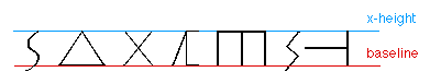
Height and Morphology - The consistency of the x-height of the characters is another important issue. Whether there should there be no descenders or ascenders on the characters as in the examples in the Finnegans Wake first edition p299 above or do we allow for variable height. The x-height factor also effects the visual morphology of characters with HCE rotating to stand on end to become Shem and ALP losing her baseline to become Shaun. If this is to be the case then HCE cannot be the same height as Shem and the current example of Shaun needs to match the angle of ALP.
What is a Sigla? - This question is also pertinent. Do we stay faithful to a sigla only policy or do we throw in the kitchen sink? Defining what is a sigla/sign could prove difficult with some examples being used only once by Joyce and often without definition. It is probably safe to assume that as long as the core family of signs are covered any addition of other elements is a bonus.
 Finnegans Wake, p308 |  Finnegans Wake, p272 |
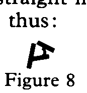
This point also raised the issue of creating scalable postscript examples of some the the graphic material in both Finnegans Wake and the Wake manuscripts. I used scanned high-resolution TIFF images of the above when working on Works in Progress for Split Pea Press but I created the diagram on FW p293 using postscript in Aldus Freehand. Postscript offers a better solution for the creation of the graphic elements as - although they take longer to create than scanning - they are stored as equations and therefore perfectly scalable. Some investigation of the original manuscripts material is undoubtedly necessary and raises the spectre of Gableresque disputes over interpretation of graphic elements and Joyce's intentions.
 47488-253 |  47488-257 | 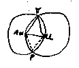 47478-10 |
 47482a-67 | ||
 47478-56 | 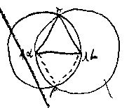 47482a-77 | 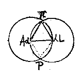 Yale-9.4-14 |
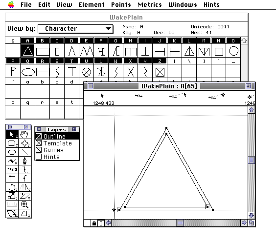
To date further development has been in a hiatus due to the need for more research, more discussion and better computer software. I started out using Letraset FontStudio 2.0 which did the initial job and considering the sigla are simple signs was adequate to the task and easy to use. The limitations came when I attempted to convert a Truetype version of the typeface for use on Windows PCs. Try as I might the Windows software would not recognise the typeface. Numerous shareware tools were used - also to no avail but ...
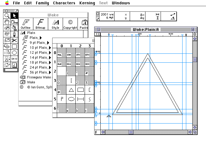
. . . this Spring I finally dipped into my pocket and purchased a copy of Fontographer 4.1.4 which accomplished the task in a snip. I now have the tools to get on and finish the job.
What now is required is a collation of views on the major issues and contents before commencing on a final redesign. I therefore welcome any views and comments on the points raised here or any further contributions.
typeface@riverrun.org.uk
In the near future I will put together a table of additions and variations to be included in the final version.
The next steps:
Ian Gunn
Edinburgh, 1997-98
'To Make a List: Two Preparatory Puzzles on the Threshold of Book III' - David Hayman, European Joyce Studies 5: Probes: Genetic Studies in Joyce, 1995, pp254-279.
Review of The Sigla of Finnegans Wake by Roland McHugh - Louis O Mink in A Wake Newslitter, New Series, Volume XIV No 5 pp82-84.
The Sigla of Finnegans Wake - Roland McHugh, London: Edward Arnold, 1976.
'Wakean Cryptogenetics' in Joyce upon the Void: The Genesis of Doubt - Jean-Michel Rabate, London: MacMillan, 1991, pp69-111.
'Alphybettyformed verbage: the shape of sounds and letters in Finnegans Wake' - Jean-Michel Rabate, Word & Image, Vol 2, No 3 July-September 1986 pp237-243.
The Textual Diaries of James Joyce - Danis Rose, Dublin: Lilliput, 1995.
As a rough stand-in until I find the time and expertise to finish a complete Wake typeface I have quickly amended the original Textual Diaries typeface to add a number of extra characters. Bear in mind these are rough trials and the metrics, layout and encoding are currently only what was expedient at the time. Here are copies of the Version 2 typeface for both Macintosh & Windows.
There are two PDF files providing the Keyboard Layout and the Font Layout.